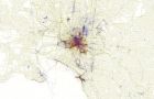
Further to the post I recently published in relation to the worlds tourist hot spots (here), showing a heat generated map of the most photographed locations on the planet. I have just came across another interesting piece of the puzzle. Eric Fisher has posted on Flickr a very fascinating series of images, of the worlds largest cities and where locals and tourist’s are taking their images. The explanation of the color coding is as follows:
- Blue points on the map are pictures taken by locals (people who have taken pictures in this city dated over a range of a month or more).
- Red points are pictures taken by tourists (people who seem to be a local of a different city and who took pictures in this city for less than a month).
- Yellow points are pictures where it can’t be determined whether or not the photographer was a tourist (because they haven’t taken pictures anywhere for over a month). They are probably tourists but might just not post many pictures at all.
The image above is of my hometown Melbourne, and as you can see the tourist’s don’t really get out of the city area that much, except for the trendy bayside suburb of St Kilda, to the South.
Erics full set of images for all cities can be found here
A clickable map to hopefully locate your city, can be found here